
RUSSIAN BEAR VODKA //
RUSH ENERGY
Russian Bear Vodka wanted to launch an new alcoholic energy drink into the market catering towards the 18 -24 years target audience. The CLIENT wanted a street edge, iconic style. The Logo design and development went over FOUR rounds but the result was well worth the time taken.
The Design
The logo design was aimed to appeal to the '20-Somethings' clubbers and students alike. We created an identity that had energy, impact and in-store recognition. The Russian Bear logo was recreated in an unique way as the icon.
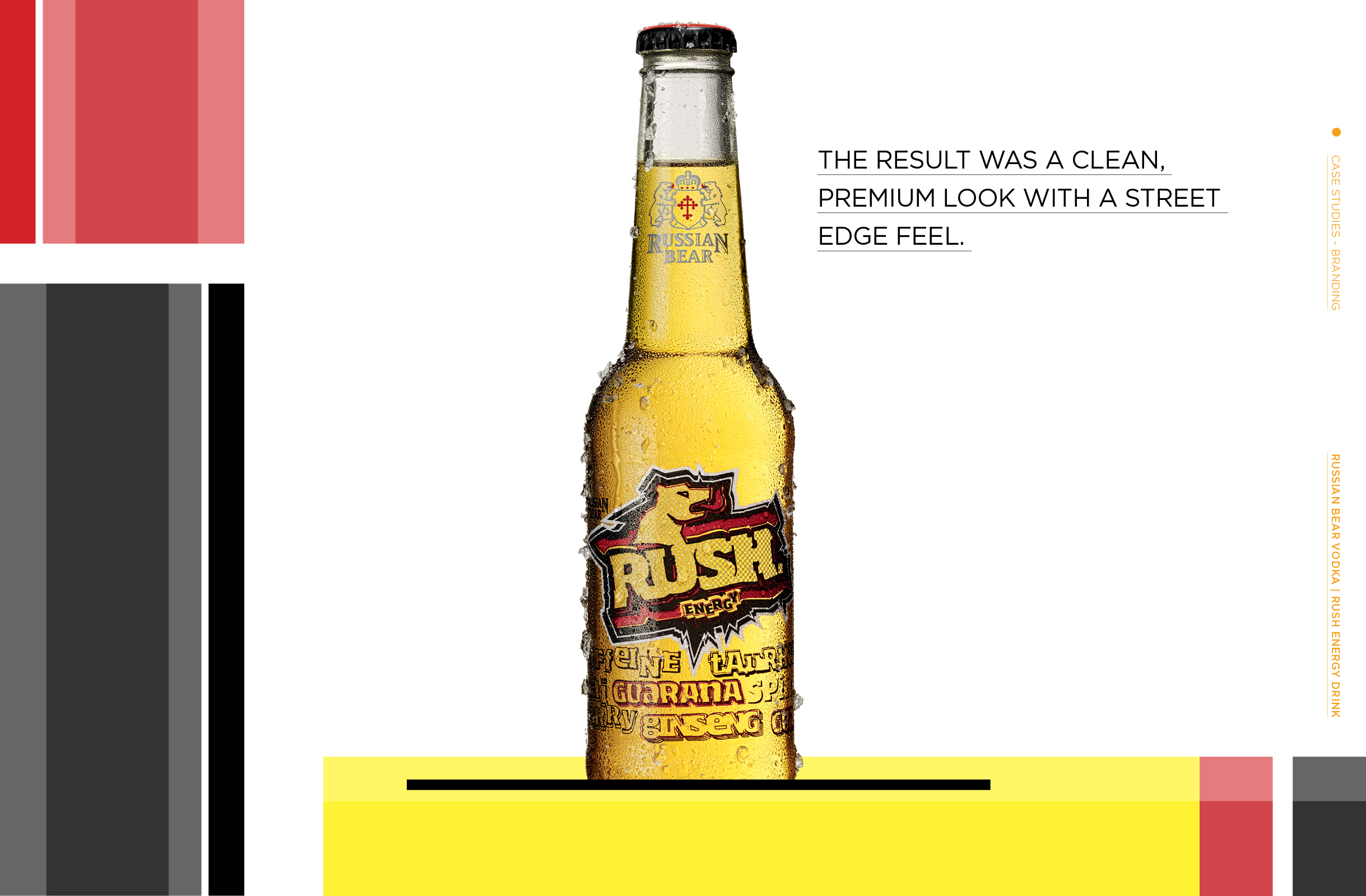
Fresh fabricated typography coupled with glass decoration onto the bottle created a design that would integrate with the energetic liquid behind. As you drink the bottle their are many little cue’s highlighting this integration.

Implementation:
Packaging
Glass decoration onto the bottle created a design that would integrate with the energetic liquid behind. As you drink the bottle their are many little cue’s highlighting this integration.
Implementation:
The Campaign
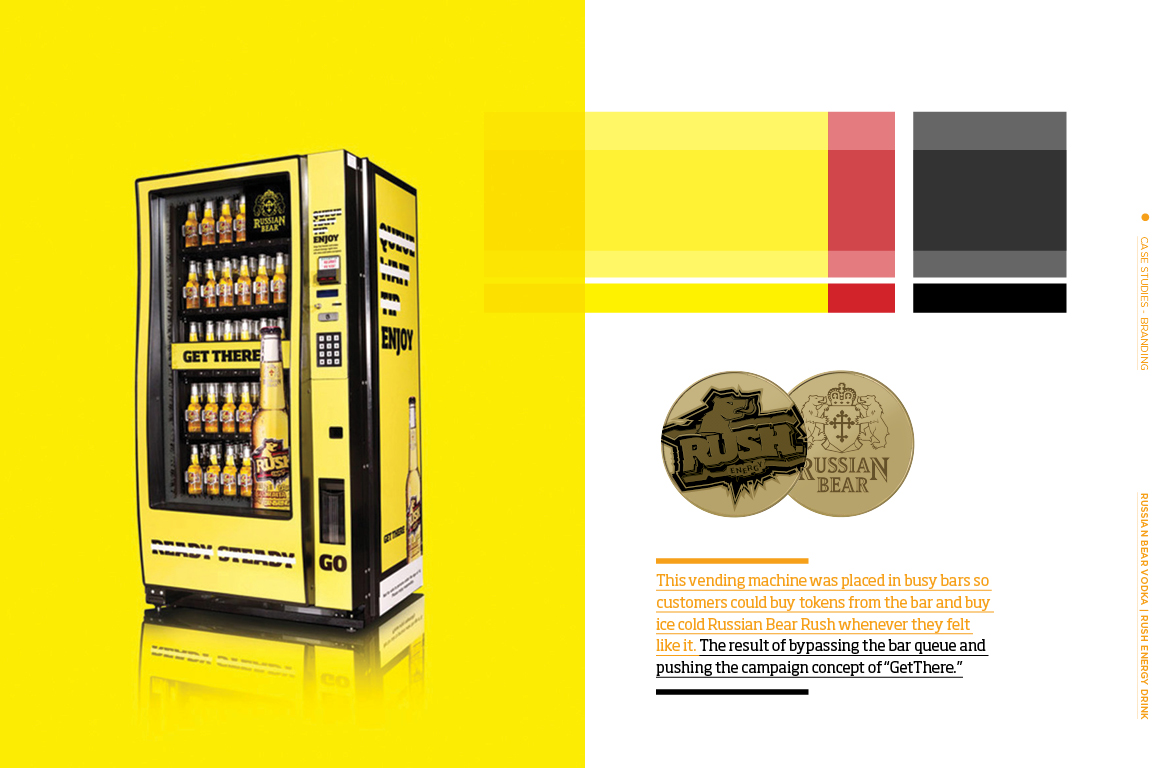
This vending machine was placed in busy bars so customers could buy tokens from the bar and buy ice cold Russian Bear Rush whenever they felt like it.
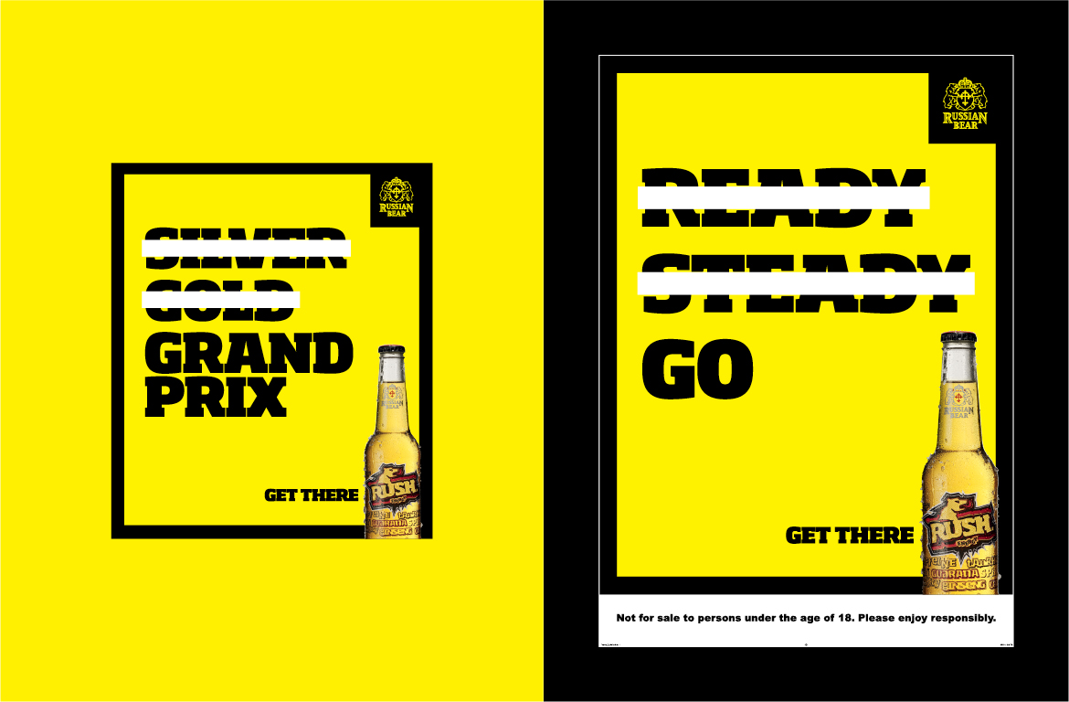
The result of bypassing the bar queue and pushing the campaign concept of “GetThere.”
Credits
Agency: Young & Rubicam
Client: Russian Bear Rush
Creative Director: Clinton Bridgeford
Graphic Designer: Ryan Daynes
Art Director: Ryan Daynes